Your donation will support the student journalists of West High School. Your contribution will allow us to purchase Scholarship Yearbooks, newsroom equipment and cover our annual website hosting costs.
Worst of the worst
February 17, 2020
Plaid, stripes and Comic Sans.
Over the past 20 years, there have been plenty of bold uniform choices from every program at West. While the school colors are currently dark green and Vegas gold, West High coaches have been playing with a variety of colors and styles since the turn of the century.
There have been some good uniforms, some bad and a few ugly. Then there are the very ugly.
Number 10 – Baseball “Dark Ages W” (’06-’07)

Head coach Charlie Stumpff has always been an advocate for the use of cursive on his uniforms since he took over the program in the early 1990s, but this might just be too much. There’s hardly anything wrong with this uniform apart from the cap, but unfortunately, this hat displays one of the ugliest looking letters found on any West High uniform.
I think both Stumpff and I would agree the new script ‘W’ that has become a staple on the uniforms since 2013 far exceeds its archaic-looking predecessor.
Number 9 – Boys Wrestling “Flying Trojan” (’08-’12)
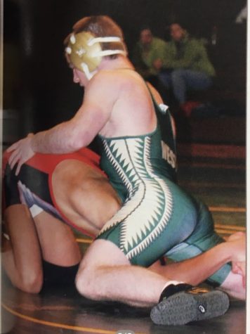
Putting wings on the side of a wrestling uniform is a daring move, and one that I applaud greatly. These uniforms, however, never got off the ground.
These uniforms might be better suited for the high-flying WWE than the traditional Iowa high school wrestling.
Number 8 – Girls Tennis “Aquawomen” (’13-’15)
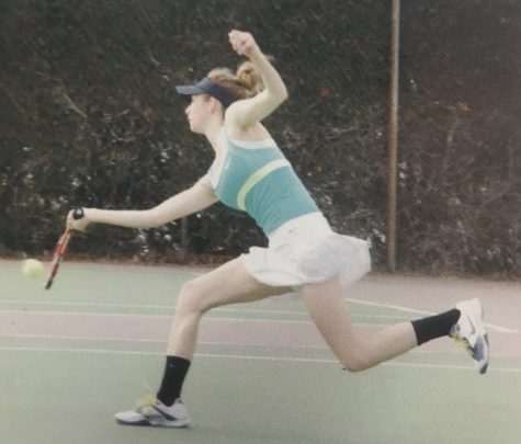
Black visors, white skirts, turquoise tops and a lime green stripe. Despite being almost unrecognizable as belonging to West High, this uniform wouldn’t be terrible if there was any consistency in colors.
Spectators must have had a hard time watching the team in this uniform, especially considering that it blends into the green surface of the court.
Number 7 – Boys Cross Country “Galea” (2015)
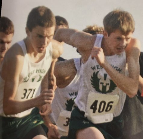
There’s a reason the boys cross country team only used these white tank tops for one season.
The attempt to redesign the Trojan logo was quite the daunting task, and one that proved unsuccessful for this uniform that chose to omit the gold aspect from years prior.
Number 6 – Girls Track “The Banana Bunch” (’00-’20)
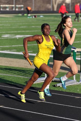
Celestina Nuro-Gyina ’22 runs down the track for the last 100 meters of the 400 meter leg of the distance medley relay race. West placed fourth in a time of 4:50.73.
For over 20 years, fans of the West High girls track team have been subject to the public eyesore that are the patented yellow uniforms. Glaring and obnoxious, the bright yellow monstrosities dominate all eight lanes of attention whenever the Women of Troy hit the track.
Old traditions seem to die hard for head coach Mike Parker, who to his credit has captured six state titles with his banana costumes since taking over the program in the 1990s.
Number 5 – Boys Golf “Bad in Plaid” (2013)

The boys golf team has more uniform turnover than any program on this list due to its limited roster size, giving them plenty of opportunities to produce something hideous enough to land them in my top 10. Every golfer knows that mixing patterns is against proper golf etiquette, and the diagonal stripes and plaid on this outfit are clashing worse than Tiger Woods and Phil Mickelson at the 2001 Masters.
Also, please retire the lime green. Forever.
Number 4 – Softball “Supersonics” (2004)
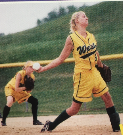
The knee-high sock and bright yellow coloration alone catapulted this uniform into the top 10. The fact that these uniforms look like they belong in an adult recreation basketball league is what helped them reach the top five.
I understand that it gets hot in the summer and that shorts might be better for the player’s well-being, but it’s not going to help your case in this list.
Number 3 – Boys Swimming “Red Means Stop” (2000)
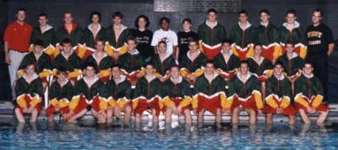
If swimmers thought they were safe on this list, they were surely mistaken. The combined City and West swim teams wore these stoplight-themed warmups during the early 2000s, proving that red should never be considered for any uniform worn by a West High athlete.
I’m sure the Trojan swimmers had no vote in these jackets, but there was no way I could walk away from this crime scene after witnessing the ugliest display of unity in our school’s history.
Number 2 – Girls Soccer “Foot Locker” (’00-’01)
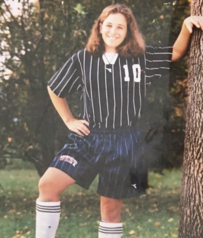
Maybe it’s the fade of the photograph, but these uniforms nearly look dark blue and the brand is unrecognizable. The vertical stripes are atrocious, and if it wasn’t for the ‘West’ on the bottom of the shorts one would think they were watching 14 officials out on the field.
Getting on the referee’s good side is part of the game, but you don’t need to dress like them.
Number 1 – Boys Track “Comic Sans” (2003-2012)

There’s no better way to intimidate your opponent than slapping a ridiculous font on the front of your jersey. These uniforms are incredibly frustrating, because the design and color scheme are surprisingly excellent, only to be ruined by 12 letters in Comic Sans text.
The absolute worst part about these uniforms? They were renewed.
Not only did the athletic department approve these uniforms once, but they ordered another shipment in 2010 with the exact same font.
The potential for these uniforms and their ultimate demise from one simple error is cause for their number one ranking on the worst West High uniforms of the last 20 years.
